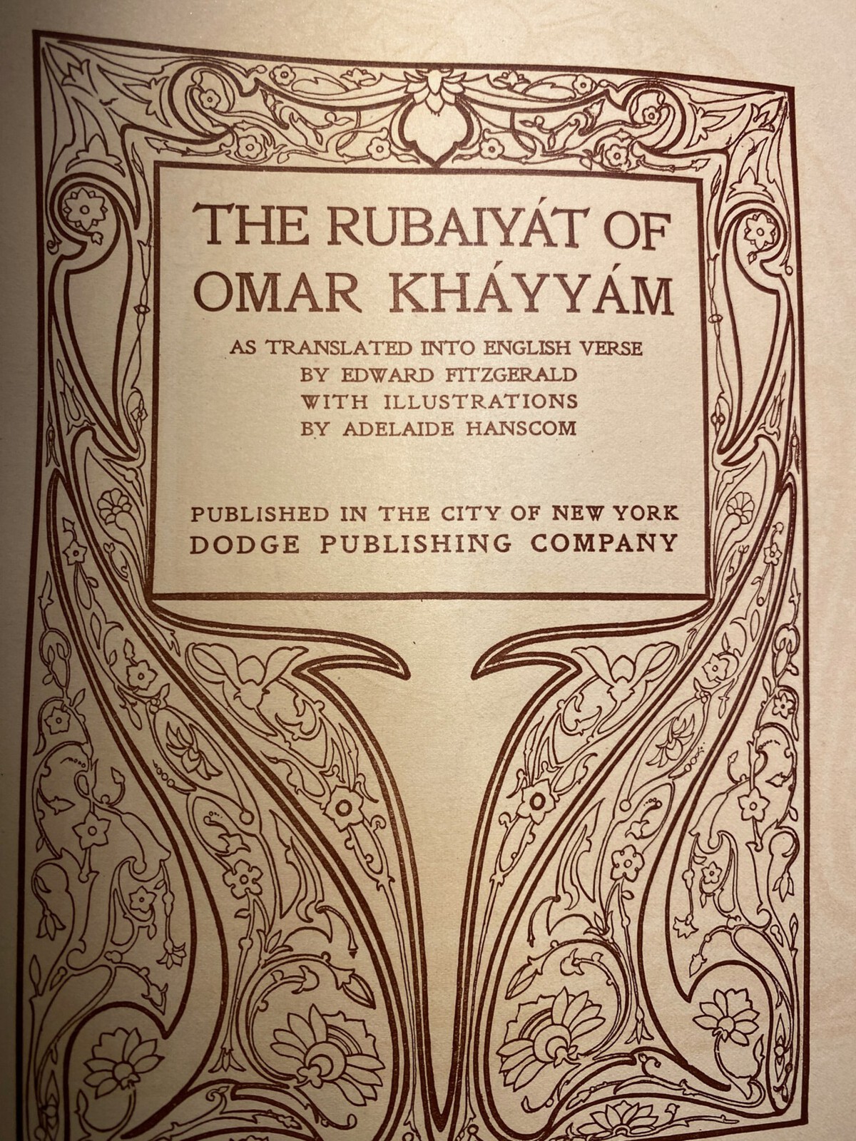
The Rubaiyat of Omar Khayyam:
1905 Dodge Hanscom 'Original' Edition
The history of this Rubaiyat edition, both personal and historical, is quite a story.
This was not the first Dodge Publishing Company Adelaide Hanscom edition I had encountered. I have a 1914 copy and a 1916 color copy. However, this one predates both of them and so has the ‘original’ photo-illustrations. That’s why I’ve titled this one as the ‘Original’ Edition.
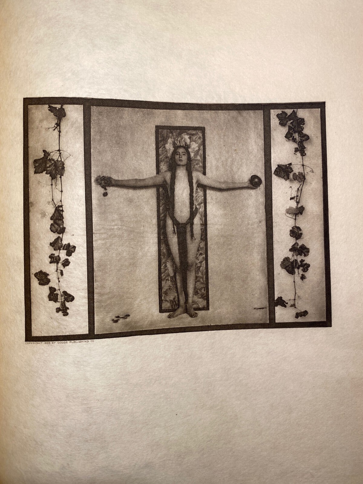
As for what ‘original’ photos actually means: I don’t believe I knew this exactly when I wrote up either the 1914 or 1916 editions, but Adelaide Hanscom’s first/original ‘run’ with the Rubaiyat was in 1905 with photographs that clearly pushed the limit (i.e. nudity) and originally earned her recognition/fame through its popularity. The later ones (i.e. my 1914/1916 ones) do not have the more ‘out there’ photos. They are toned down and thus do not impart that awe-inspiring and somewhat shocking reaction that you get from these photos.
As for the personal history story, this copy was originally brought to my attention by a visitor. They provided enough so I could post about it, then soon after I bought it from them. So it is marked as contributed by them, but I now have it in my collection. Having it personally to hold and behold, I massively updated this post with photos that I’ve taken and the write-up to what it is now. I must express my intense gratitude to The Austin Estate for providing such a fine copy with such a rich history. Such a fantastic copy that merited such a robust entry on this website!
You can see all the images taken, my critique of the illustrations, and more related to this 1905 Rubaiyat edition below!
Update 06/2025: Added information on the rough add date (since it had two versions) and added info about ‘offset’.
Update 06/2025 #2: Fixed typo in a photo caption (arts outstretced -> arms outstretched).

Publisher: Dodge Publishing Company (New York)
Year: 1905
Artist: Adelaide Hanscom
Contributed by: The Austin Estate
Added to Site: Late March/Early April 2020
The Book Itself
The cover is a soft purple leather.
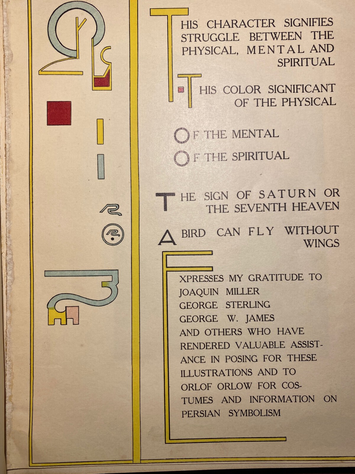
I find it interesting that this early edition has credits to the models who posed for ‘illustrations’ and the later ones do not. I feel like something is missing without it, especially since the ‘thanks’ page itself is quite beautiful.
Original comments on the ‘sepia bleed’ seen in this copy:
You’ll see more of the photos in their own section, but there’s a quirk I’m detailing here with them as it relates to the stock they are printed on. The images aren’t adhered onto the page like via glue or anything like other copies I have (and what I thought originally due to how crisp the edges are), but are actually printed onto this thinner stock and are buffered by blank sides of the preceding page and followed by a full blank page. This isn’t that unusual in my mind, at least, the protective buffering, but what I found interesting was that on this copy it was as if some of the photos had bled onto both/either of those blank sides (I am guessing over time?). Like a faded imprint had leeched into them. I took a picture of a prominent one as an example below. I asked myself: what about these prints caused that? I don’t have an answer yet, but I am investigating what caused such…sepia bleed.
Day after update on the ‘bleeding’:
I was directed by a family member to the idea of iron ink sort of ‘rusting’ to answer my question. And it does seem to be a very plausible answer after reading on iron gall ink, printing history, photogravure, and seeing that this Etsy listing labeled the photo pages of the 1905 editions as a photogravure. The photogravure process gives more context on why these pictures are so high in quality, how they were made, and maybe why the ink situation is what it is.
As for the ink, iron ink, specifically, iron gall ink, deteriorating is apparently its own intense subject in conservation. For more information/sourcing, I will just link to The Iron Gall Ink Website. It has a plethora of information regarding, you guessed it, iron gall ink, the chemistry, and such related topics regarding it. And, I will also link to Wikipedia’s Iron Gall Ink entry as its description of the ink’s problems is concise and effective, and its references (including the aforementioned website) are intriguing to glance over.
Anyway, that’s my hypothesis for the bleed at this time!
Update (2025-06-02):
A visitor pointed out that the iron ink hypothesis was unlikely…what was more likely was the general concept of ‘offset’. You can read about it here in ABC for Book Collectors by John Carter and Nicolas Barker on pages 155-156 (just search for ‘Offset’ and you’ll find it).
The Poetry
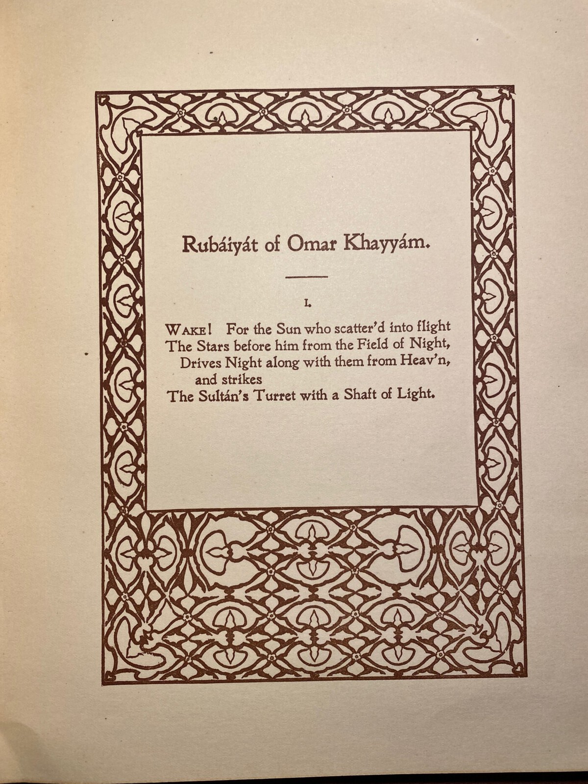
A few pages have the illustrations overlaid with/set next to the poetry itself. It is both easy to read and beautiful, but done, perhaps, too sparsely. But there is reason, maybe: the photos themselves are the true attraction here, not the poetry.
The Illustrations
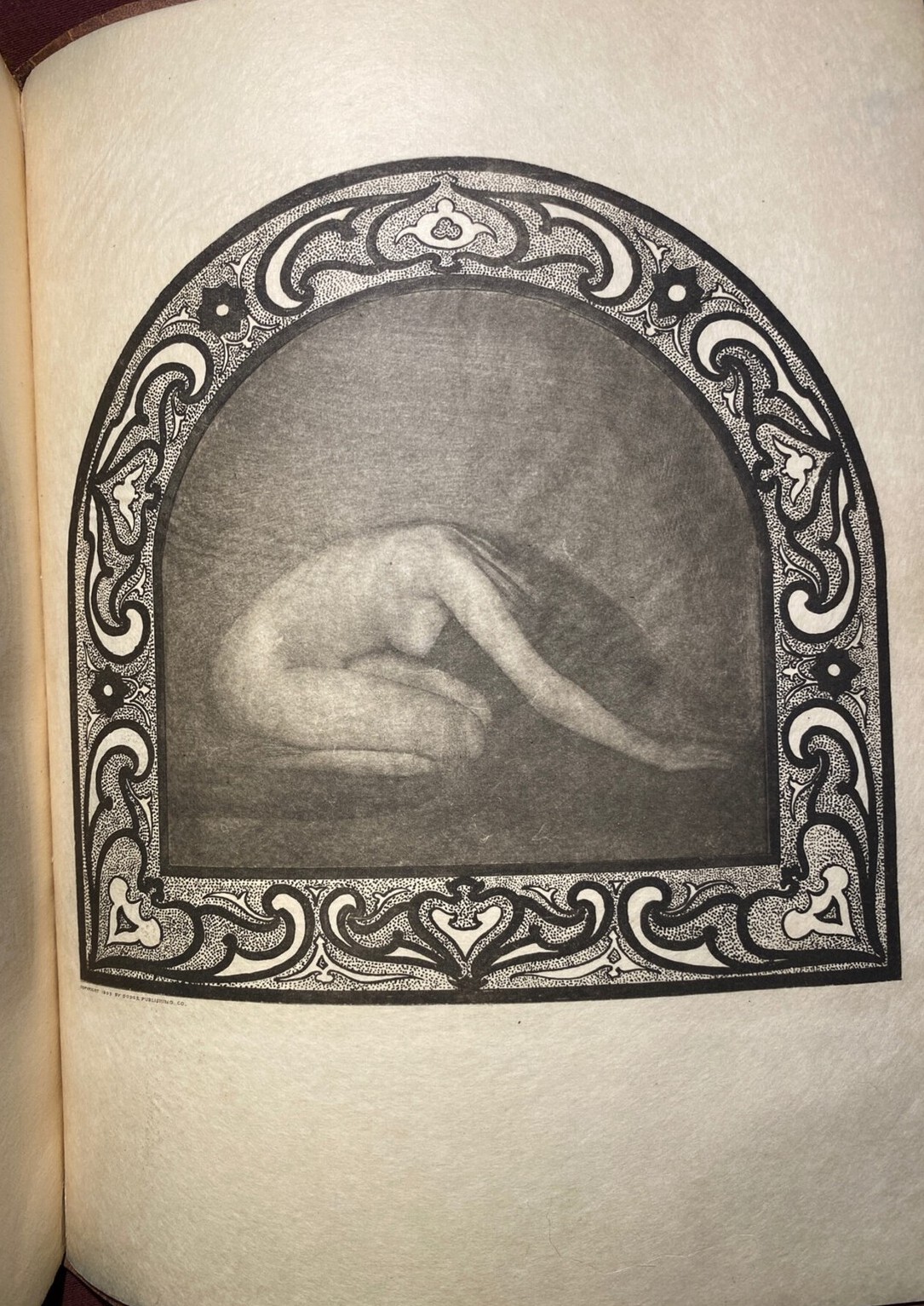
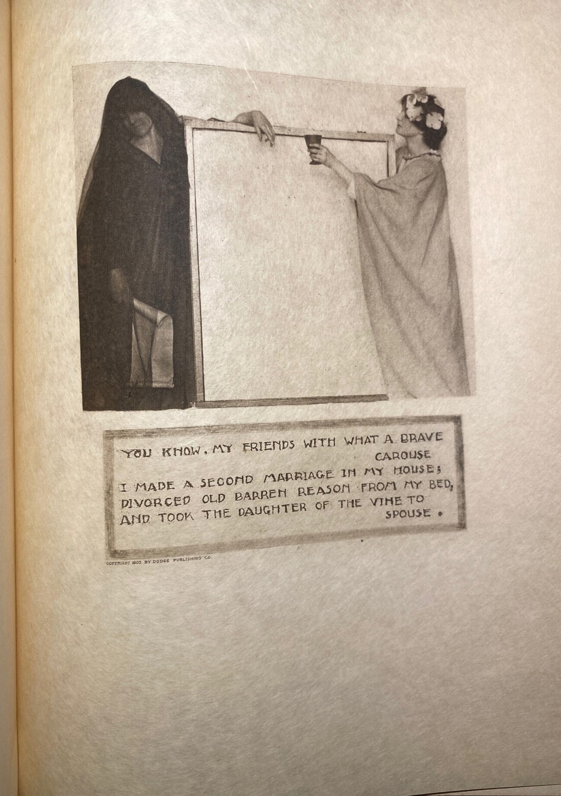
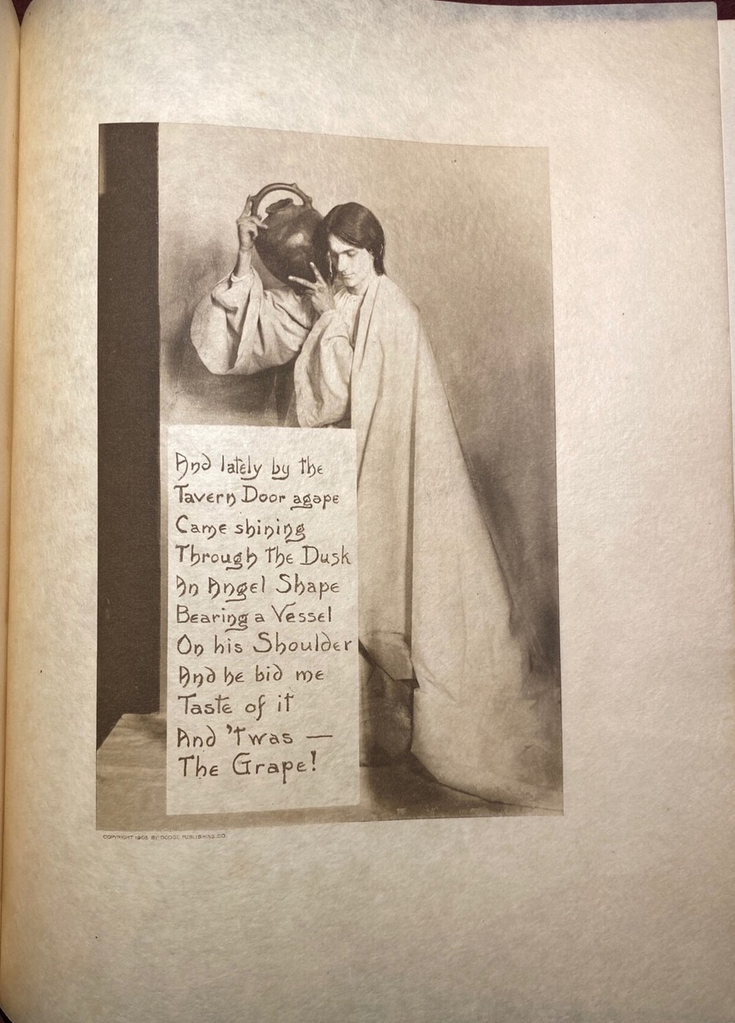
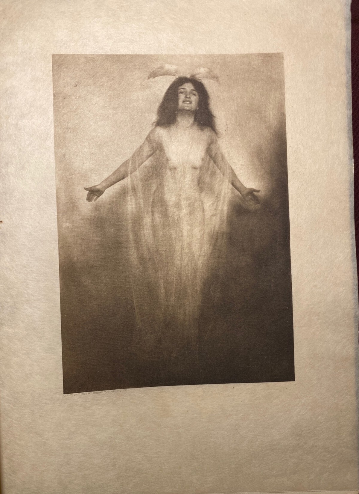
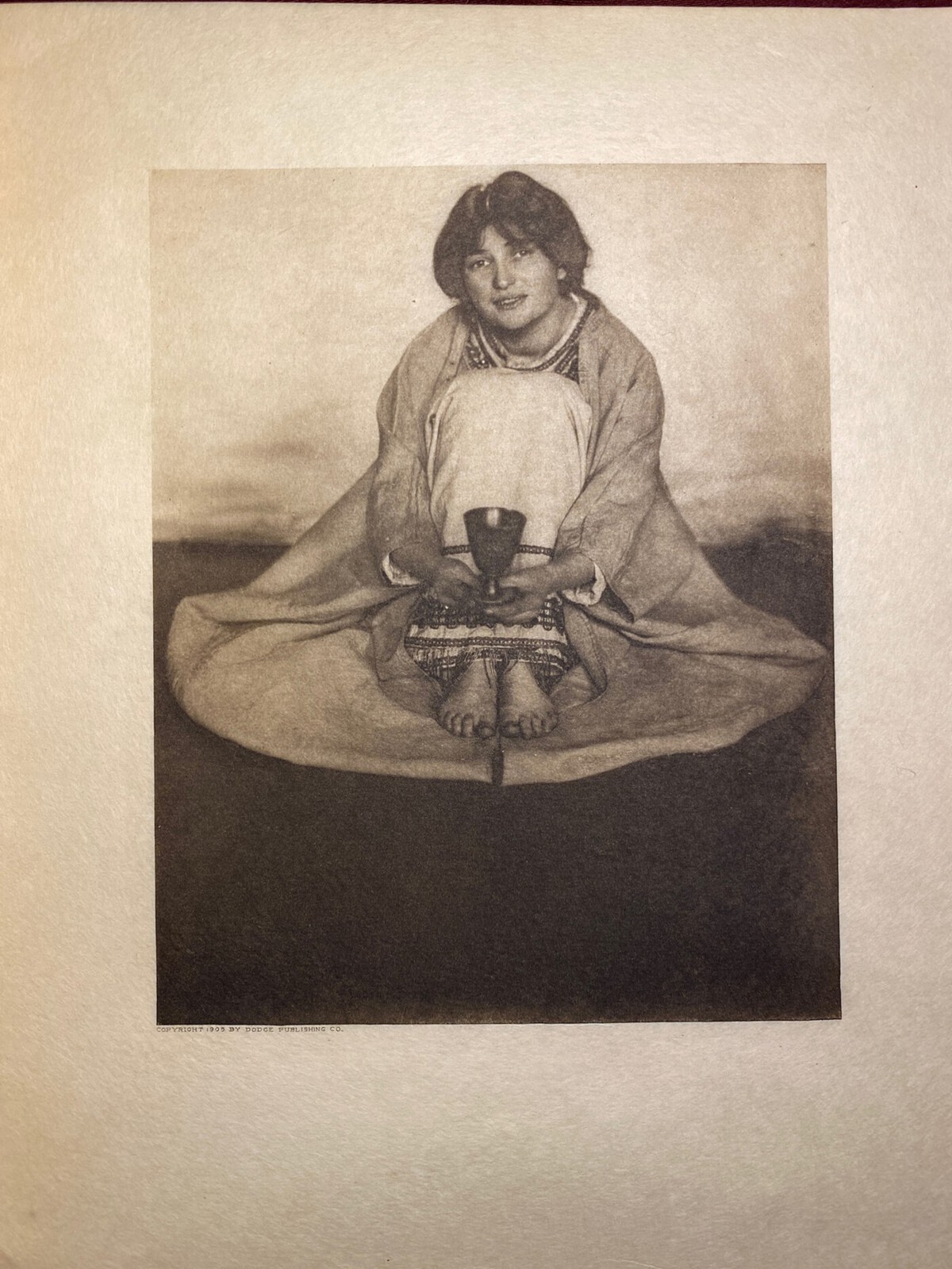
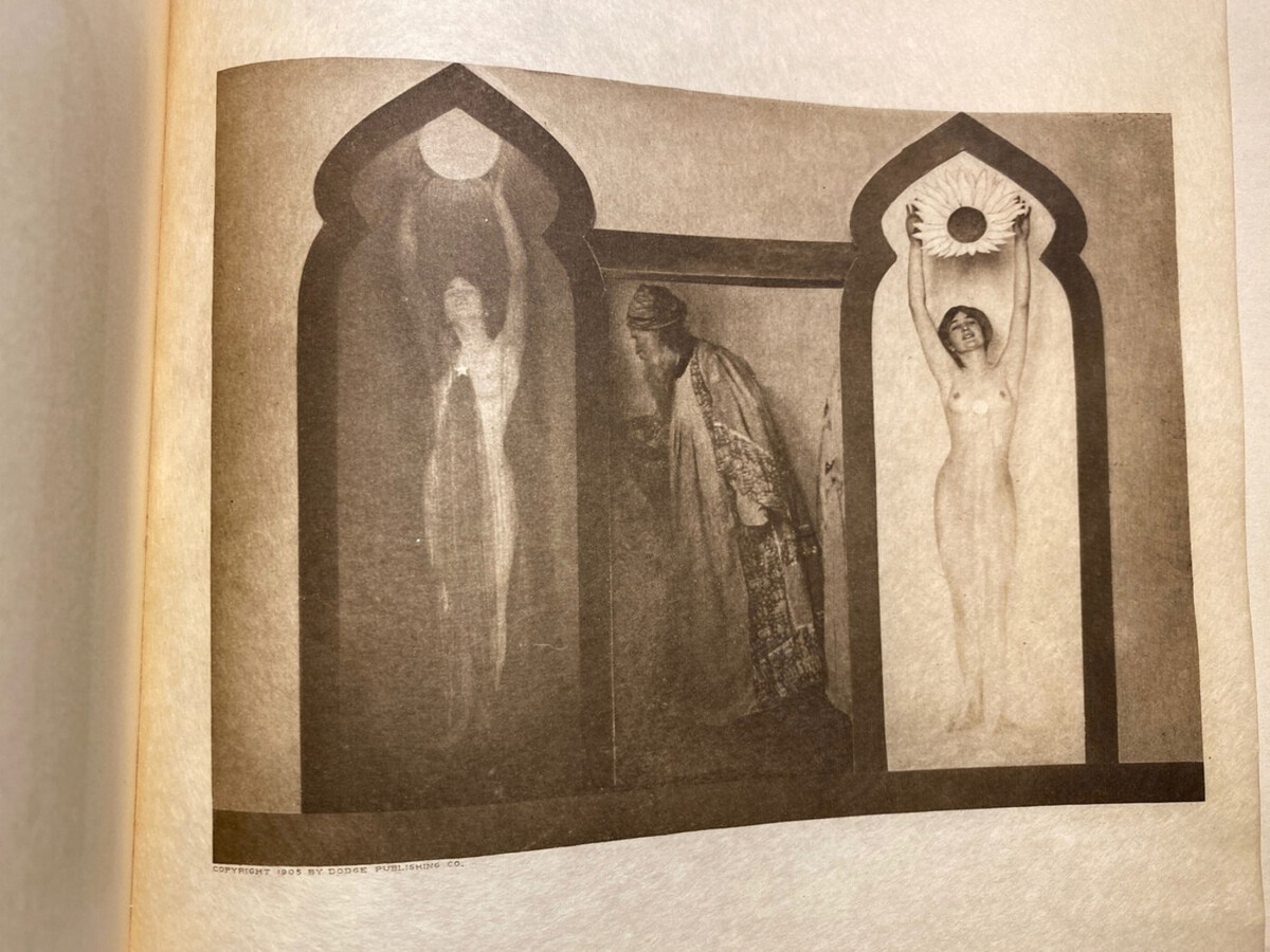
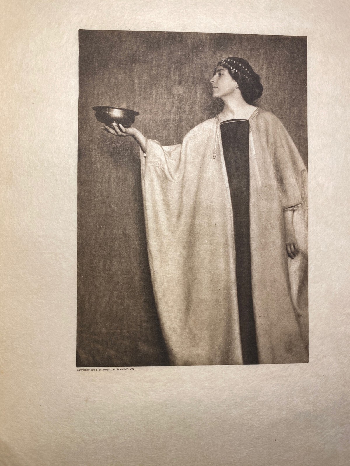
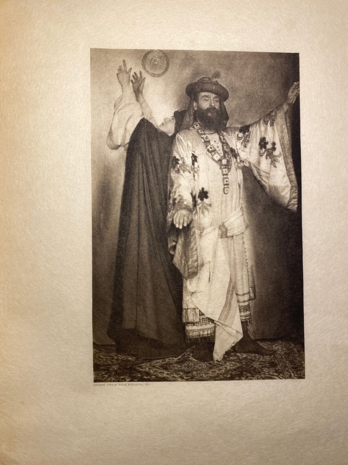
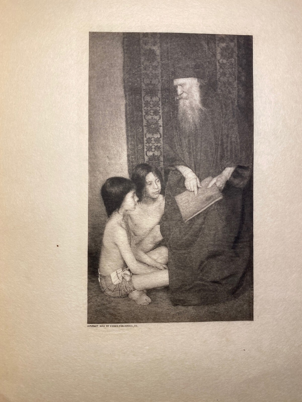
The photo-illustrations…where this edition and any with any them received it’s fame. For good reason. The aesthetic of the photos is captivating and transcends the nudity present in a few of them that may be a put-off to some. The word that comes to mind is ethereal. I understand why this edition was popular due to it. And, at the same time, I understand why the later ones did not have the more ‘groundbreaking’ photos due to sensitivity. It makes them mildly lesser for it, though.
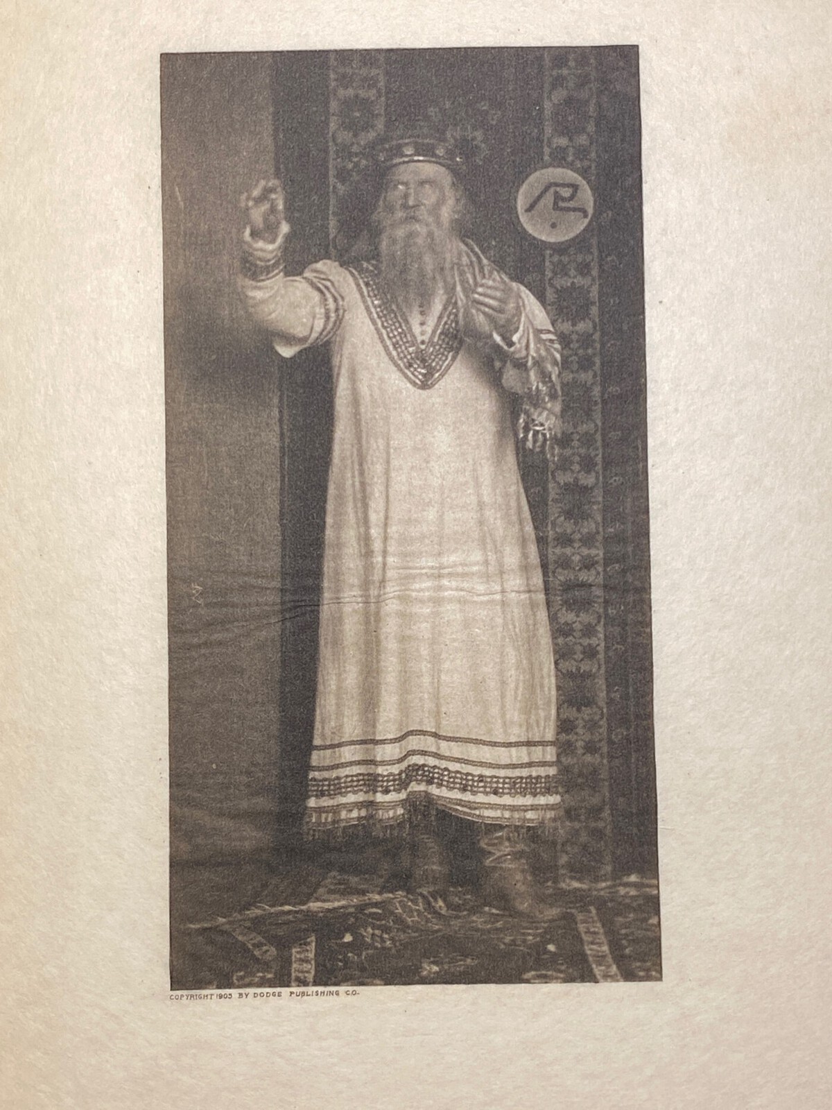
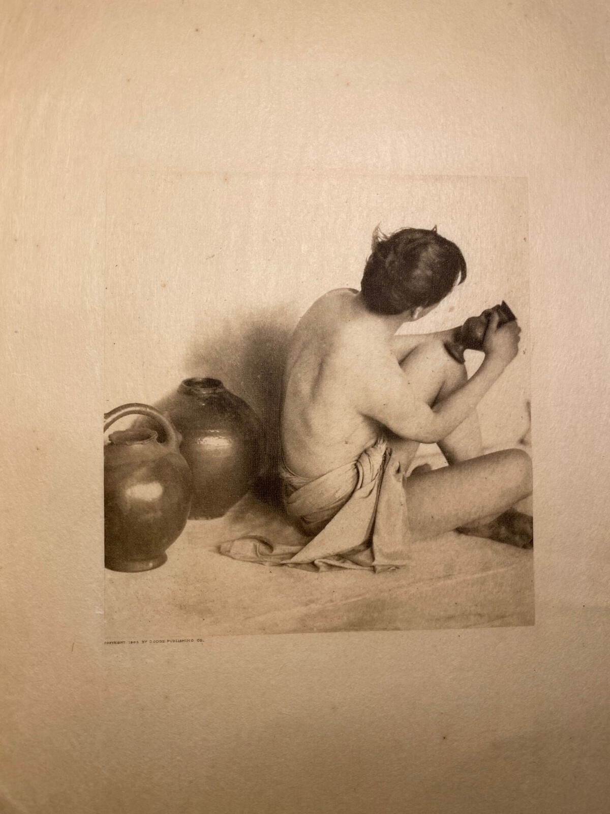
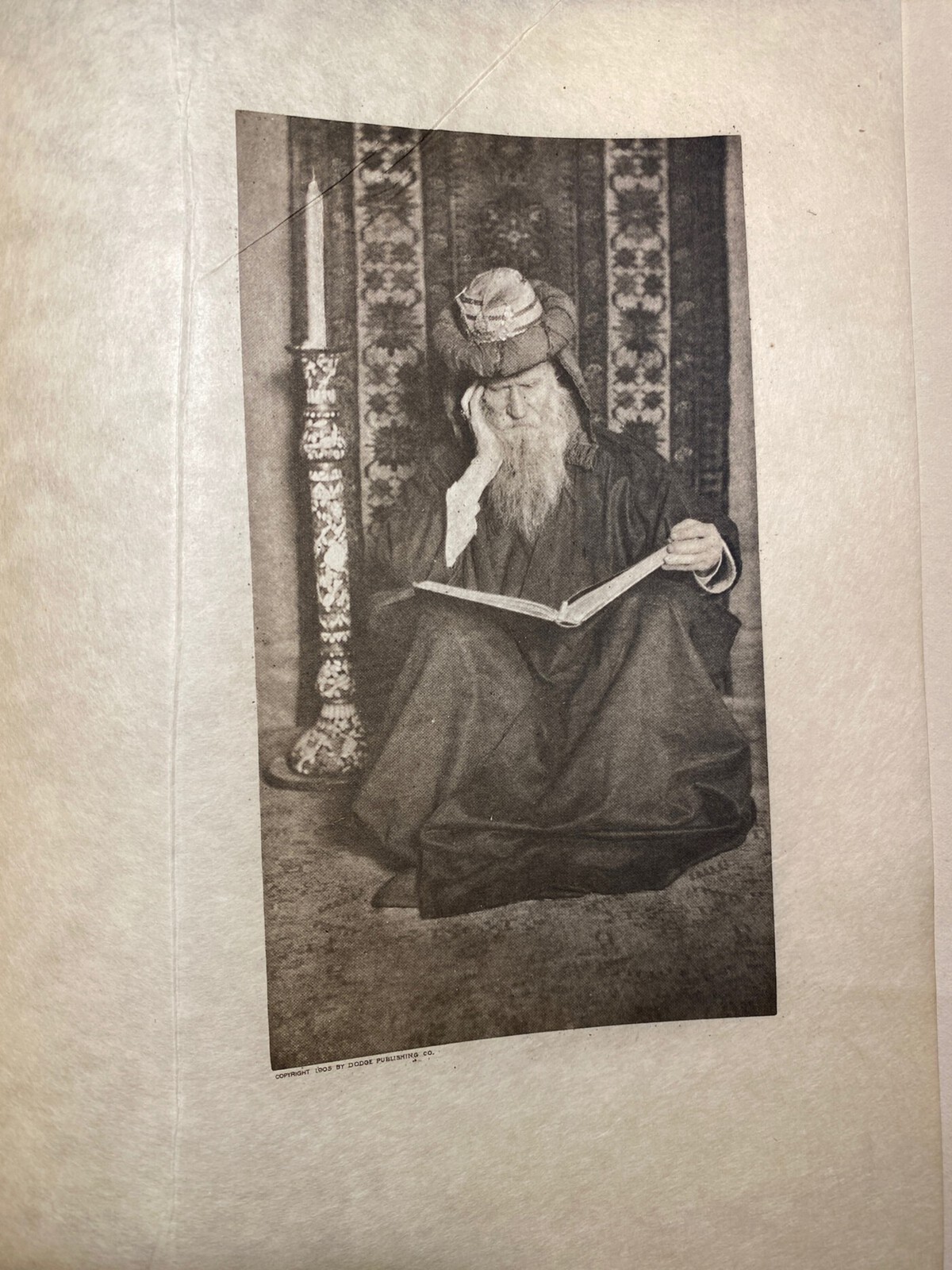
But even in the illustrations that all of the editions share, this 1905 edition ranks superior to the later ones. How/why? Because this edition has higher quality prints of the photos. I would compare it to watching a 4K movie vs. a DVD. The detail is so much better in with these prints of the photos. The 1914 ones are more faded/white-washed (I mean that literally) and the 1916 color one doesn’t do the images that much justice. These photos feel far more authentic with their raw detail. The other editions I almost mistook for drawings due to the ‘effects’…but with these I can’t. You get such high definition and texture from them. Look at the ones of the old man with the beard: it feels so tactile and real!
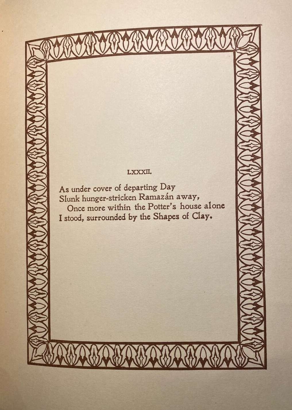
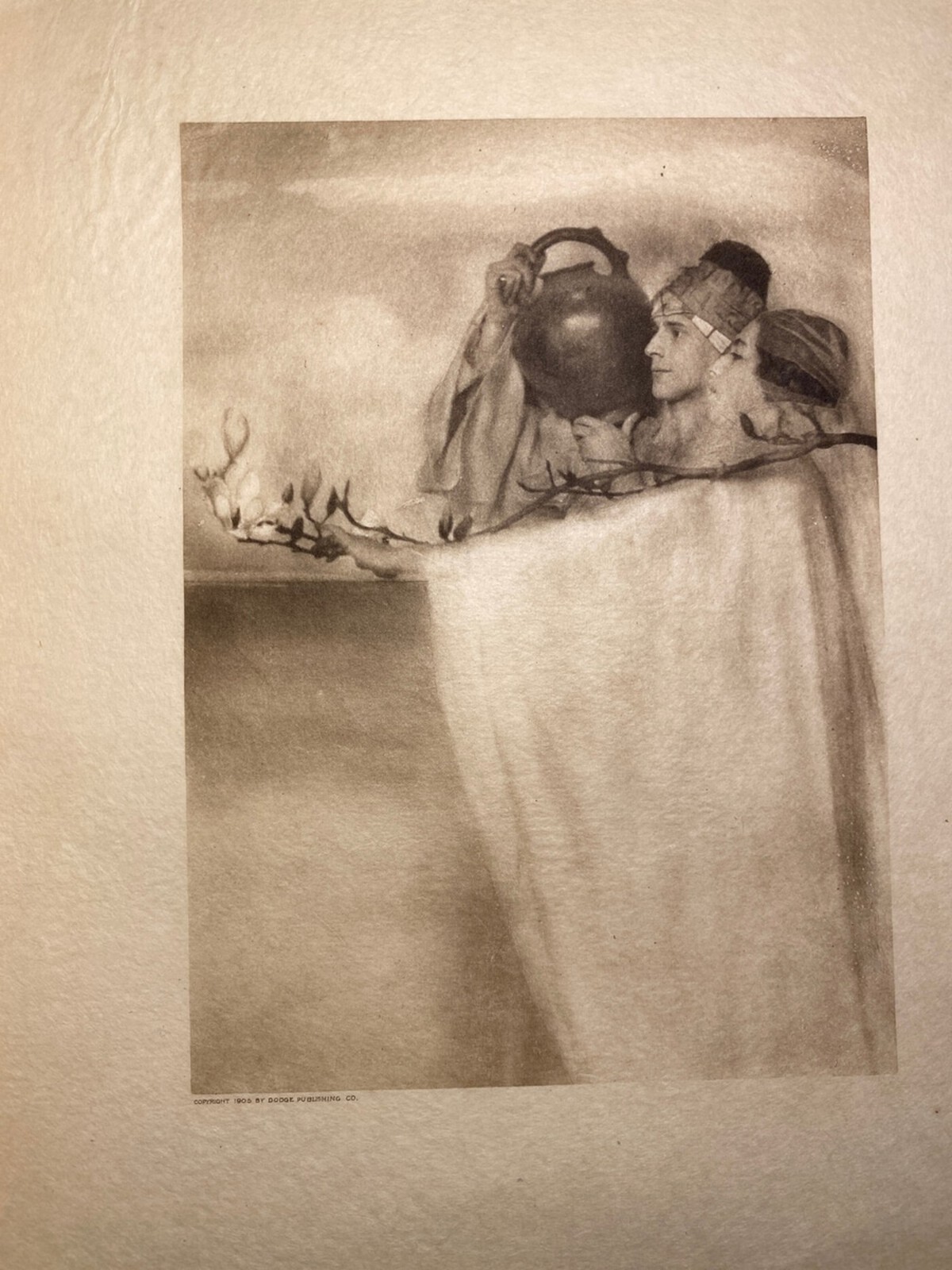
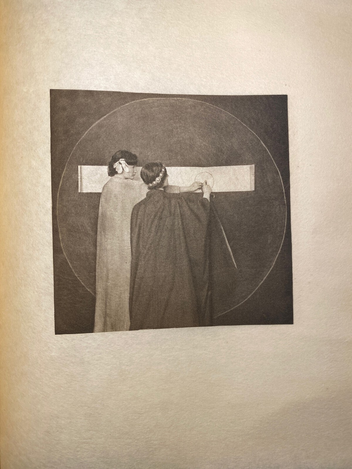
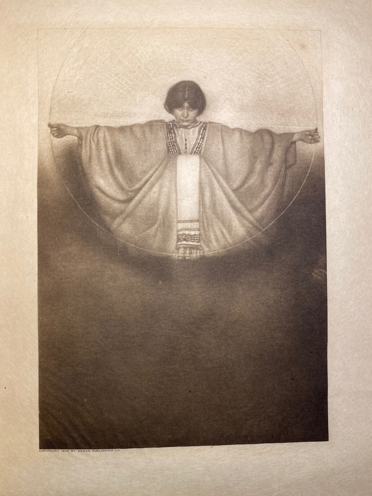
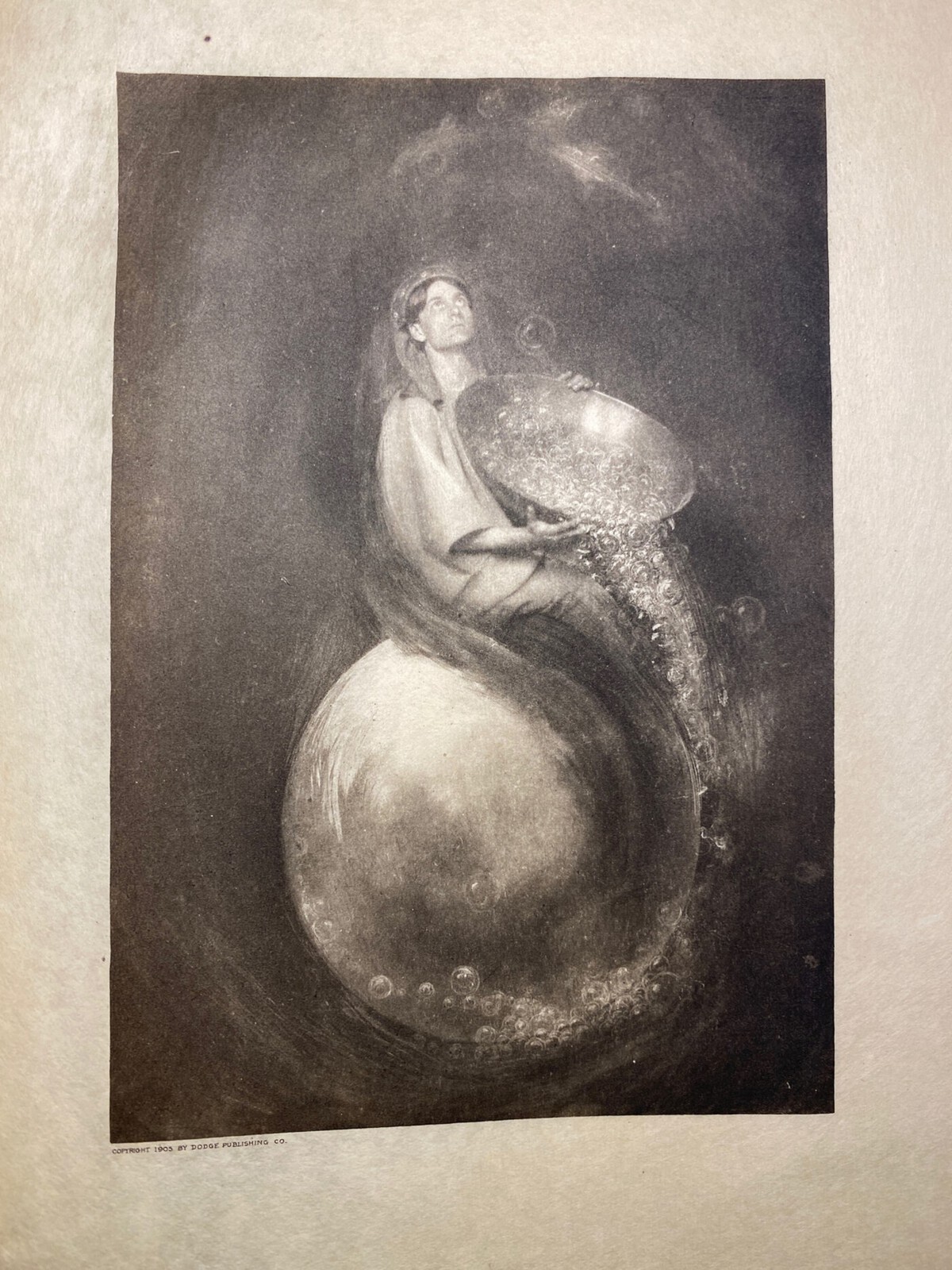
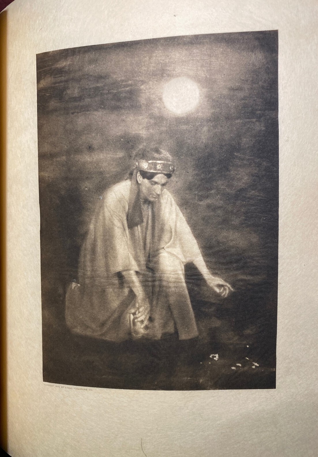
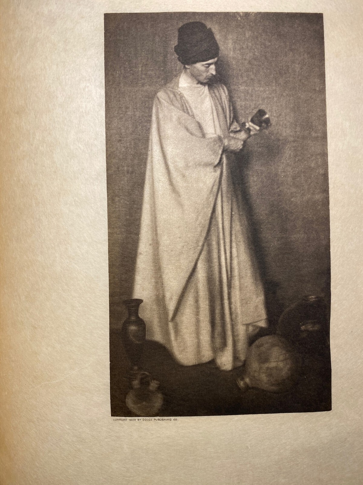
But not all of them are like that. Some of them lean more on the fantastical side of things. You know it’s a real person, but at the same time, there’s aspects of it that just make it seem so beyond, striving to mimic the ‘feel’ you get when reading the actual poetry of the Rubaiyat. The image of the woman pouring the water out on what I think to be a moon is definitely the most ‘fantastical’ photo of them all. And then the others were circles are heavily used thematically…it becomes more abstract. There is such variety in these illustrations. You go from a man polishing pots to a woman draped in very sheer cloth looking somewhat angelic. And, regardless of the directions: they nail what they are representing, as in, the quatrains. The man surrounded by pots is to illustrate the LXXXII quatrain. That one just…made me smile because I understood instantly.
So..in summary, the illustrations are on-point and fantastic while not always being fantastical.
This post by John Coulthart has some light critique of the style that I found interesting and wanted to share too.
History/Information Sourcing
Keep reading if you’re interested in my history sourcing…
Beyond finding sellers listing prints of the artwork, the historical information is most concisely found in the Wikipedia article of her…but wait, there’s more…sort of.
So I was looking at this article that was interesting/informative about Adelaide Hanscom’s history/her Rubaiyat fame. I was all set to link it as is and what not, but then I re-read the Wikipedia page on her realized: the text is basically the same between them/the same info. I found another blog post on a different blog with nearly the same content that clearly stated the text was from Wikipedia and it was published a long while ago, so I’m guessing that it’s another case of that. So. Wikipedia! Sometimes sourcing information is its own journey….
Asides from all that nonsense, I did also find this blog post on Hanscom more as an artist and it was fascinating too. Good read!